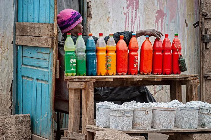
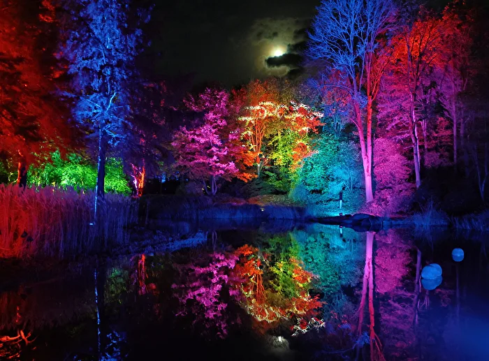
The Power of Colors
The Power of Colors is no quiet topic – it’s loud, vibrant, and sometimes as cheeky as a tipped-over paint pot. This photo contest is all about that: colors as the main subject, colors as a statement, colors as emotional power. Whether it’s radiant red, calming blue, or a bold color chaos – colors speak to us directly, without words. Or as Henri Cartier-Bresson famously said: "To photograph is to align the head, the eye, and the heart" – and colors play a huge role in that.
Harnessing the Power of Colors in Photography
The challenge level in The Power of Colors is delightfully diverse. Technically, many things are simple, but creatively it’s all the more exciting. The special challenge lies in not just capturing colors, but consciously using them as the main subject. It’s not about the object, but about its color impact. An expensive camera isn’t necessarily required: a good smartphone works excellently because modern sensors capture colors very precisely and HDR (High Dynamic Range) balances contrasts cleanly. Terms like WB (White Balance), SAT (Saturation), or EV (Exposure Value) help you control colors deliberately instead of leaving it to chance.
Creative Inspiration
Colors carry emotions. When you use them intentionally, you tell stories without words.
- Reduce your subject to one dominant color and let everything else fade into the background.
- Use color contrasts like complementary colors, for example blue and orange, to create tension.
- Look for spots of color in everyday life that have a strong impact when isolated.
- Work with repetitions of the same hues to create visual calm and rhythm.
- Photograph deliberately against your usual visual habits, like green in shadow or warm colors in diffuse light.
Technical Inspiration
Technology supports you in capturing the power of colors exactly as you perceive them.
- Use manual white balance instead of auto to consciously avoid or apply color casts.
- Keep ISO (International Organization for Standardization – sensitivity) low to achieve clean color areas.
- Avoid overexposure, as blown-out colors lose their impact.
- Work with a medium focal length to preserve natural color relationships without distortion (FL – Focal Length).
- Check the histogram to ensure no color channels are clipped.
Post-Processing Inspiration
In post-processing, you can shape colors without distorting them.
- Work deliberately with HSL (Hue, Saturation, Luminance) instead of global color sliders.
- Reduce individual colors to make the main color stand out stronger.
- Use local adjustments to selectively enhance color intensity.
- Avoid heavy presets and stay close to your original image concept.
- Try a subtle vignette to draw attention to the color.
Let’s Get Started
Now is the moment to let colors speak. You now know how to recognize color as the main subject, use it consciously, control it technically, and refine it carefully in post-processing. Take these impulses as an invitation, not a rulebook – great photos come from joy, not obligation. This photo contest offers you fresh perspectives, inspiration, and the chance to connect with like-minded creatives. Thank you for taking the time and sharing your passion for photography. Go out, look around, smile – and let the power of colors work for you.